No products in the cart.
Best Premade Album Cover Art by Genre: 2026 The Complete Visual Guide
17
May
May
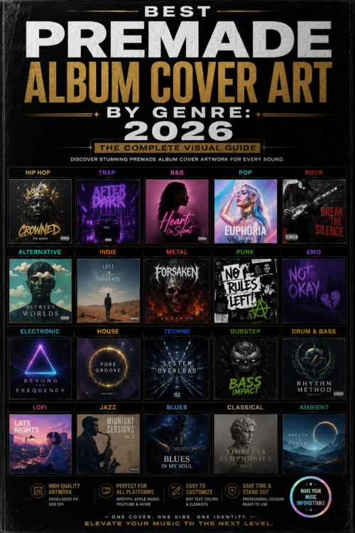
Why Genre Matters in premade Album Cover Art
Your Premade album cover art is a genre signal. Before a single note plays, listeners make snap judgments based on visual style — is this dark metal or bedroom pop? Lofi or hardstyle? The best cover arts don’t just look good; they immediately communicate the genre and energy of the music inside.
Getting this right is more important than ever. On Spotify alone, listeners scroll through hundreds of thumbnails per session. A cover art that blends in with the visual language of its genre — or boldly subverts it — is what stops the scroll.
Best Premade Album Cover Art by Genre
🖤 Dark / Metal / Darkwave
Dark music demands dark, atmospheric cover art. The most effective covers in this genre use deep shadows, muted or monochrome color palettes, eerie figures, skulls, desolate landscapes, and symbolic imagery rooted in mythology, death, or the occult. Typography tends to be aggressive, distressed, or gothic.
Visual elements to look for: Black and grey color palettes, fog/mist effects, lone figures in desolate settings, sharp contrast, dramatic lighting.
Popular in: Black metal, death metal, doom metal, gothic rock, darkwave, post-punk.
Browse Dark & Metal Cover Arts →
⚡ Electronic / EDM / Techno
Electronic music covers thrive on geometry, neon colors, abstract shapes, and futuristic visuals. The best electronic cover arts feel like you’re looking at something from another dimension — grids, waveforms, digital noise, and vivid color explosions all communicate the synthetic, high-energy nature of the music.
Visual elements to look for: Neon glows, geometric patterns, gradient explosions, laser grids, abstract shapes, dark backgrounds with bright contrast elements.
Popular in: House, techno, EDM, trance, DnB, hardstyle, dubstep.
Browse Electronic Cover Arts →
🌈 Psychedelic / Surreal
Psychedelic cover art distorts reality. Expect melting faces, impossible architectures, dream-logic compositions, kaleidoscopic patterns, and surreal juxtapositions. Color is maximalist — everything is saturated, layered, and slightly disorienting in the best possible way. This style works across a surprisingly wide range of genres.
Visual elements to look for: Warped perspectives, rich saturated colors, organic + geometric hybrid forms, third-eye imagery, cosmic elements, double exposure effects.
Popular in: Psychedelic rock, psytrance, progressive rock, experimental, indie folk, some hip-hop.
🎤 Hip-Hop / Trap / Phonk
Hip-hop cover art is as diverse as the genre itself — from minimalist typographic covers to extravagant portraits. Trap and funk have developed their own distinct visual language: darkened photography, aggressive typography, red and black color schemes, smoke and car imagery, and a raw, lo-fi edge.
Visual elements to look for: Bold typography, urban environments, silhouettes, red/black/gold color combinations, smoke/fog effects, gritty textures.
Popular in: Trap, phonk, drill, boom bap, R&B, lo-fi hip-hop.
🌊 Lofi / Chill / Ambient
Lofi and chill covers are intentionally soft, warm, and nostalgic. Inspired by anime aesthetics, vintage illustration, and muted photography, these covers use pastel colors, soft gradients, everyday scenes (rainy windows, cozy rooms, city streets at night), and a gentle visual pace that matches the music’s energy.
Visual elements to look for: Pastel color palettes, illustrated or painted styles, warm lighting, nature scenes, lone figures in calm settings, vintage film grain.
Popular in: Lofi hip-hop, ambient, chill, new age, acoustic.
🚀 Synthwave / Retrowave / Vaporwave
Synthwave’s visual identity is one of the most recognizable in music — it’s the 1980s reimagined through a neon lens. Grid lines receding to the horizon, sunsets in pink and purple, chrome text, palm trees silhouetted against electric skies. Vaporwave adds a more ironic, glitched, and pastel-toned dimension to this aesthetic.
Visual elements to look for: Neon pink/purple/cyan color schemes, sunset gradients, retro grid lines, chrome effects, 80s-inspired typography, stars and space.
Popular in: Synthwave, retrowave, outrun, vaporwave, chillwave, future bass.
How to Choose the Right Premade Album Cover Art for Your Music
When browsing premade cover arts, ask yourself these four questions:
- Does it match the energy of my music? A loud, aggressive track shouldn’t have a soft, pastel cover. A meditative ambient piece shouldn’t have a chaotic, neon design.
- Does it fit the genre conventions? Listeners have genre visual expectations. Subverting them is powerful — but only when intentional. Accidentally mismatching will confuse your audience.
- Is it unique enough to stand out in a playlist? At thumbnail size (60px), your cover needs to have a clear focal point or strong color contrast to catch the eye.
- Does it represent your brand as an artist? Cover art is part of your long-term visual identity. Choose something you’d still be proud of in five years.
Exclusive vs. Non-Exclusive Premade album Cover Art
At Buy Cover Arts, we offer both exclusive and non-exclusive licenses:
- Non-Exclusive: The design can be sold to multiple artists. Lower price point, faster to get. Good for artists releasing frequently and testing new sounds.
- Exclusive: Once sold to you, the design is removed from our store permanently. Only your release will ever use that artwork. Essential for artists building a distinct, recognizable brand.
For your most important releases — albums, EPs, career-defining singles — always choose exclusive cover art. For single tracks or experimental releases, non-exclusive is a smart, budget-conscious choice.